I wonder why there are not more people posting designs for the openBC contest. About 20 submissions a week is not that much considering the 10k Euro – which is not too bad. Maybe, they are all working and submitting in the last week?
And still, the desings submitted so far are more variations than great ideas and concepts. As posted before, i think one of the reasons is that there are too much restrictions in the brief. So i will play around a bit to see what happens when the brief is ignored:)
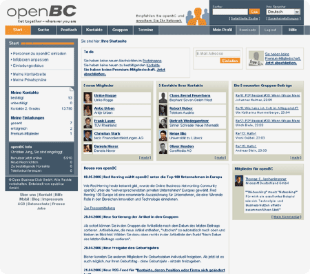
First i thought, the most interesting page to start with is not the profile but the start page (i would call it dashboard). Why? Because it is more complex, there are more functional elements on it and it is shows better how openBC wants to „talk” to their customers in future, what’s the approach and how is the brand communicating. The profile page will be done a lot easier afterwards.
This is the dashboard as it is today. To me, this page is far too cluttered. The typeface is 10 and 11 pixels because otherwise all this would not fit in an 800 pixel browser window. Noticeably, a lot of content and functions is displayed more than once. E.g. there are 3 different links for the invitation and they are spread over the whole page.

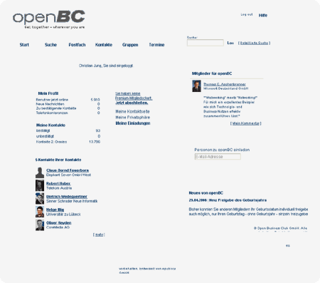
So what i am doing first is to clean up and rearrange the contents, just rough and dirty to get an overview. Larger view and the steps in between in this pdf.

So this is something to start with. I think i will post a first draft tomorrow.