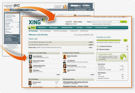
The openBC crew invited me to a blogger workshop today. While i am not a dedicated blogger, this is a great honor! Around 10 people were discussing with Daniela and Lars about the new Logo, the new site design and the corporate weblog.
When the new logo leaked public on last weekend, i didn’t understand it really. My first impression was, XING must be something like a token. Just shuffle randomly the several million combinations of 4 x 24 letters, pick out the ones that have no meaning in any language, delete the ones that are unpronounceable, and you will still have several hundred „names” to choose from. What i did not consider is that xing is a very common word in China, it is a common name or a word that can carry a wide range of different meanings. It is something like an envelope in which you can put something into. In german, xing means almost nothing, in american english i remember it means „crossing”, which is not a bad connotation.
When building an international brand, this neutrality surely is an advantage. And while the afternoon passed by, this stange name became somewhat cosy to me, because it can be pronounced in different ways. You can say „ksing” with a sharp sibilant at the beginning, or you can say „ssing” which makes it much more likable. I think, XING is a really cool name, good choice.
The logo itself is very well done, no question about it. It is a good idea to write the word in capital letters (lowercase would be ugly). The uppercase XING looks almost like an abstract construction from diagonal and vertical lines, pretty nice. There is a small problem when accidentially rotated by 90 degrees or upside down:

Funny. It reads „nix” :)

1 thought on “The new <span class="caps">XING</span>”
Comments are closed.