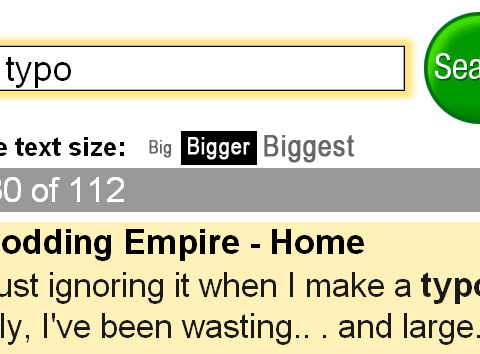
From the „Fisher Price School of Design” (Russel Beattie): big.com. It’s not only bigger typography, the search result itself also seems to be simplified, or shortened. Or are there only less results? Anyway, this refers perfecty to my favorite trend in webdesign.
Unfortunately, there is another trend when it comes to mobile phones. Playing around with mini opera on my borrowed k750 cellphone reminds me of having to visit my oculist. The type rendered on the screen equals not more than 5pt type in real world…