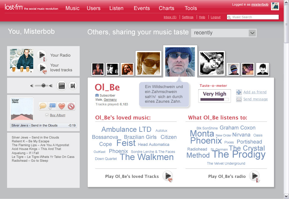
I have been writing some thoughts on LastFM here, and i just felt like photoshopping a bit. Just an experiment, comments appreciated.
In my view, the neighbour radio (or better: loved tracks radio) is the most interesting and powerful feature, and LastFM should focus on. The site is packed with functions, and for novice users it is really hard to find out the value. My intention is to make LastfM easier to access and show these users where the fun is.
What if the dashboard (your personal start page) would look something like this:
The left part is yours, where the current playing radio is located and where you can see your recently scrobbled tracks. At the top, there are the buttons to start your personal radios.
The right part is where your neighbours are. Not only all-time neighbours, because they change not frequently, there could also be neighbours of the last week or so. There is a pulldown at the top where you could select the time range (in this case it says „recently”).
The thumbnail row doesn’t need an explanation, i guess. It works like an endless Macintosh dock, you could scroll through the images to the right and the left. Maybe it would also show the users’ most recent shout in the balloon, that would help.
By clicking on one of the images, it shows what this person likes (loved tracks) and what he currently listens to. There are buttons at the bottom that would start the radio at the left hand side.
What do you think, good idea, bad idea?

no question … all 5 thumbs up! ;-)
I wish I were a designer! Yeah, it’s cool! LastFM just got some money, maybe they can afford a re-design ;-)
It’s strikes me how fast we adopt to new visual concepts like the endless Macintosh dock. Great work! I am curious how long it takes LastFM to adopt it :-)
check out this:
http://www.neon.de
and move the mouse over the image strip at the bottom